
AUTUMN/WINTER 2022
Winter 2022

My illustration on the walls of Alexandra Palace
Hello. Welcome to my new illustration journal.
I sometimes crave a place where ideas can be set out and images absorbed, in greater detail than just a grid of small squares. Bitesize social media flashes can be fascinating, but they are like sparklers, when sometimes it’s good to sit by an open fire.
Some of my favourite makers and creators write beautiful blogs where I can get lost in their world and get to know them as friends.
That's the aim of this journal - to be a little place in the vastness of the Internet, where I can better explain who I am and what I do.
Thank you for being here!
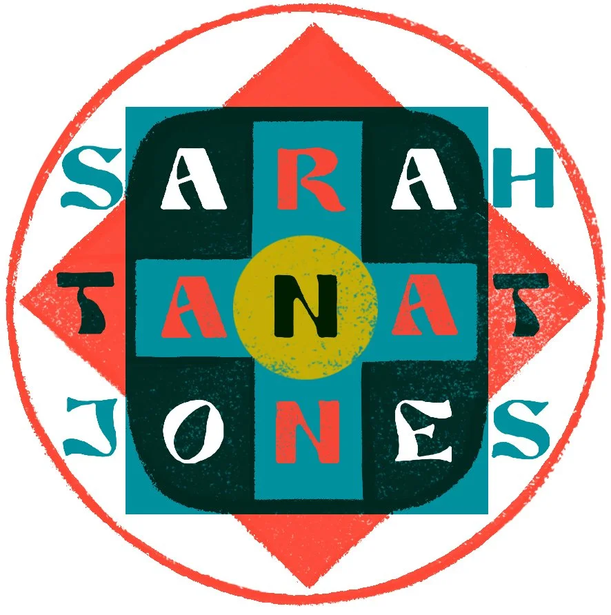
New Logo

I kicked off the New Year with a logo revamp, above. Here’s my old logo:

This had been my logo for years, but I began to feel that there was more to life than ink lettering on a white background, especially after two arid years of Covid. I’m really inspired by colourful, rich patterns, most especially paisley, and medieval stained glass. Both contain surprisingly similar geometric forms and colour play.
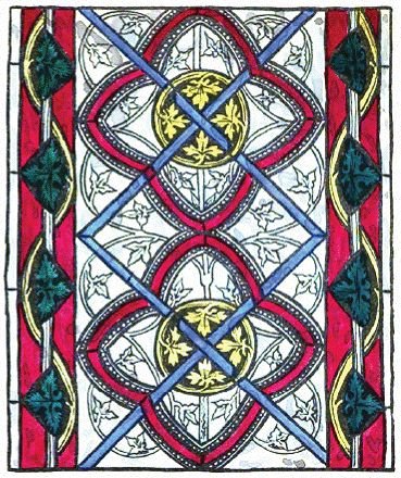
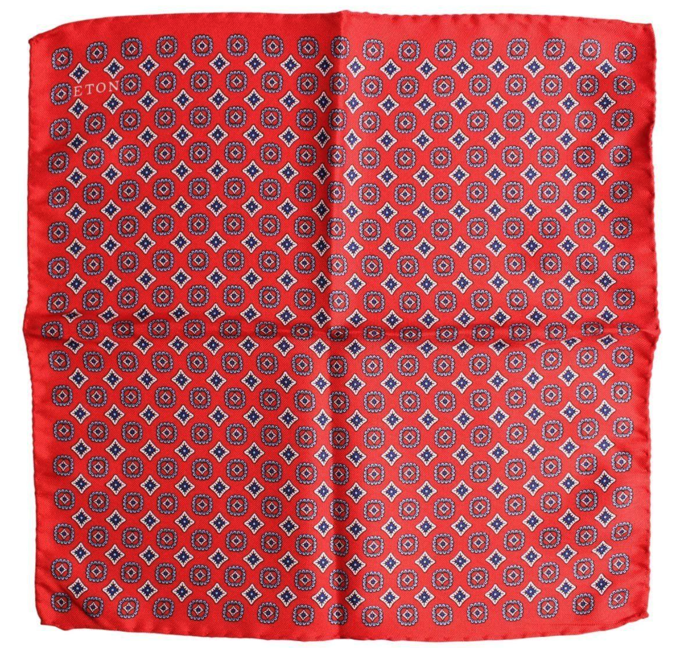
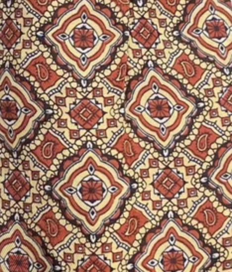
Paisley from India and stained glass from Medieval England
Luckily my name lends itself to such patterns - it’s three words of five letters, with a sense of symmetry across each word. I sketched something out and, like many sketches, the first iteration couldn’t be improved by fiddling. It became my new logo. I’ll be using the black and white version, below, as a stamp for sending out items from my shop.

The Observer Food Monthly

I illustrate Jay Rayner’s Happy Eater column every month in the OFM. This month the theme was about older diners in restaurants being embarrassed by their need for light, quiet and a comfy chair when dining. Specifically, a reading light for the menu. I wanted this image to have a sense of intimacy and I knew that the brightness of the light should be the focal point and a jarring contrast with the rest of the image.

My rough for the illustration
I also used the rule of three for the dim lights that the young partying diners are enjoying. It is intented to draw the eye upwards from Jay and out into the rest of the room. I really enjoyed working on this piece. A combination of an accurate portrait, lighting and careful colour placement, and making a clear point straightaway - three of the big illustration challenges that are fun to get stuck into.
Alexandra Palace Illustrations

Printed leaflets with my illustrations for Ally Pally
I was asked to draw a variety of skaters for Alexandra Palace’s famous ice rink. Sadly these illustrations were put on ice (in more ways that one) for quite a while as the pandemic hit. But now they are up and on display at Ally Pally.

I’ve been to the ice rink there myself, and it was lovely to see my work at a huge scale - probably the biggest it’s ever been!

Two of my skaters
Thanks to Rida at Lovers for working with me on this lovely project.
A Baby’s Name Painting
My son Esra turned one year old in January 2022. What an incredible first year of motherhood I’ve had - I feel very lucky indeed to share my life with my wonderful little boy. I made him a name painting for his present.

E for Elephant, S for Seal, R for Rabbit and A for Antelope.

I hope he enjoys looking at it as he gets older, and I’m sure it won’t be the last painting I make for him.

See ya!
Thank you so much for reading. See you in Spring.
